Introduction
A great collage isn't about squeezing more photos into one frame — it's about giving a small set of images a rhythm. The tools in Collage Maker · Photo Editor make the mechanics easy; this guide covers the choices that make the result feel intentional.
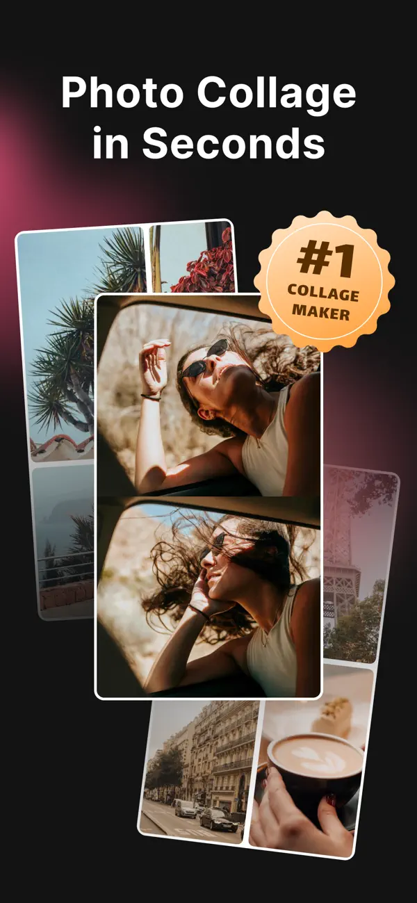

Prepare your photos
Before you open the editor, gather a few more photos than you think you need — 8 to 12 for a six-tile collage is a healthy buffer. Look for:
- One hero image that could stand alone.
- Two or three supporting shots with a similar palette.
- Detail or texture shots — hands, food, fabric, light — to break up faces.
Missing something? Use the built-in Unsplash and Pexels search to fill gaps with free, high-quality stock imagery without ever leaving the app.
Step-by-step workflow
- Choose your canvas first. Decide where the collage will live — feed, Story, Reel cover, TikTok — and pick the matching ratio before you place a single photo.
- Drop in your hero. Place your strongest photo first, ideally in the largest tile or the top-left of a reading grid.
- Fill supporting tiles. Alternate wide and tight crops so the eye has somewhere to rest between busy images.
- Unify with a filter. Apply one filter across every tile to bind photos shot on different phones or lighting.
- Tune spacing and background. Small gutter = editorial. Wide gutter = playful. Match the background color to the dominant tone in your photos.
- Export in high quality. Save at the highest resolution the app offers so nothing softens when the platform re-compresses.

Choosing a layout
A layout is a promise about how the eye will move. Three families cover almost every use case:
Grids
Predictable, editorial, endlessly reusable. Best for product flat-lays, recap posts and profile-friendly compositions where order matters.
Frames
Grids with personality — rounded corners, uneven tile sizes, magazine-style asymmetry. Use when you want structure without stiffness.
Freeform / moodboard
Photos overlap, tilt and layer. Best for a mood, a memory or a brand board. Riskier — but the most distinctive look when it lands.
Social sizing guide
Common export ratios and where each one belongs:
| Ratio | Best for | Notes |
|---|---|---|
| 1:1 | Instagram feed, Facebook posts | Balanced, works in profile grids. |
| 4:5 | Instagram feed (portrait) | A popular portrait format for feed posts. |
| 9:16 | Stories, Reels, TikTok, Shorts | Keep key elements away from top/bottom UI zones. |
| 3:4 | Pinterest, print | Good for editorial-style boards. |
Common mistakes (and easy fixes)
- Too many focal points. Every tile shouting = nothing heard. Demote a few photos to detail shots.
- Mixed color temperatures. Apply one filter across the whole collage to unify warm and cool photos.
- Random spacing. Pick one gutter width and stick to it, unless breaking the rhythm is the whole idea.
- Wrong canvas for the platform. Don't post a square moodboard as a Story — it wastes 50% of the screen.
- Overworked backgrounds. Pattern-heavy backgrounds compete with your photos. Solid or textured neutrals almost always win.
FAQ
Do I need design experience?
No. Templates cover most cases, and the freeform canvas gives you room to experiment when you're ready.
What does the export look like?
Sharp, high-quality output ready to share to Instagram, Reels, TikTok or Messages.
Can I use my own photos and stock together?
Yes — the Unsplash and Pexels search sits alongside your camera roll, so you can mix personal and stock imagery in the same collage.
Which devices are supported?
iPhone and iPad running iOS 17 or later.
Ready to make one? Download the app and try the workflow with your own photos.
Download on theApp Store